Mission
Radio Faro is a talk show podcast with guests, streaming on various platforms. The programming on Radio Faro consists of a mix of music selected from pop and rock classics, both Italian and international. The talk shows are fun and engaging, with guests joking and interacting with the hosts. The client requested a logo that represents the chosen name, but with a unique and clean design, adaptable to different platforms and social media images. The logo must be iconic and able to connect with the audience and the programming style. Currently, there is only one show, but the goal is to expand the programming to include other genres, including more serious ones and the ideas for the future needs to be reflected in the logo as well.
Case study
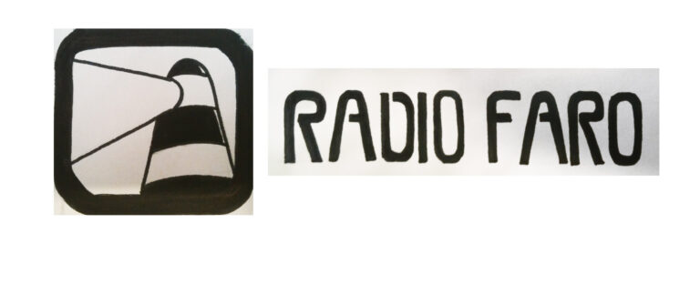
After some initial idea exchanges with the clients, we established the general style for the logo. The requirement was that the logo should include a separate graphic element along with the printed name. I had creative freedom to explore different options and was suggested to add the design of a lighthouse (which is the translation for the word “Faro” in Italian). Additionally, the decision was made to elaborate a logo that evokes the style of 70’s music posters. I decided to create a unique font, which I then integrated in various ways with the drawing of the lighthouse.

My work
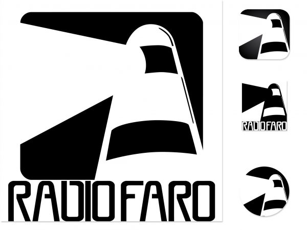
Starting from the sketch, different options were created in black and white using Adobe Illustrator. Since the client became attached to the gradient choice, it was decided to keep it for the brand identity as well. The winning design features the graphic of the lighthouse with the title underneath, along with variants for round and square profile images.


Impact
The result for the Radio Faro logo is a symbol easily recognizable by its users, thanks to its distinctiveness, characterized by an iconic image, clear lines, and black-and-white colors.


