


Jacinta Chaminade is a writer, musician, and professor of communication. She contacted me to design the layout for her book and ebook featuring her original play, Artichoke Soup.
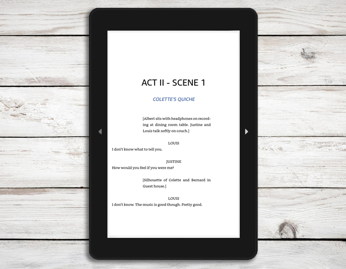
Both the book and ebook needed to adhere to the script’s format. Initially, we discussed adding the original music associated with the play directly into the ebook, but for this project she ultimately decided against including sounds to avoid distracting the reader.
This job was straightforward. Once we decided on the paperback size and contents, my task was to create the appropriate layout, select the lettering, and arrange the pages accordingly.
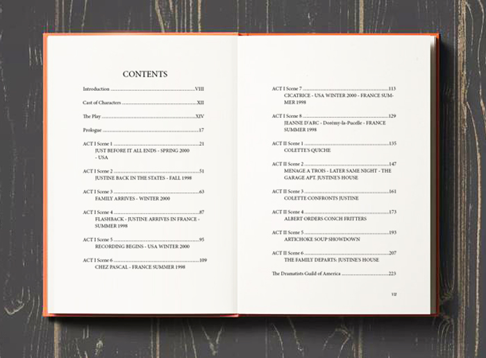
Editing a book is something I personally enjoy. Although it may seem that every design is the same, it actually requires imagination to make each project unique. This could involve adding fancy fonts or a theme to each chapter, and playing with images and text. During this phase, I usually go back and forth with the client, proposing ideas and allowing for feedback and requests that help develop new concepts none of us had initially considered.
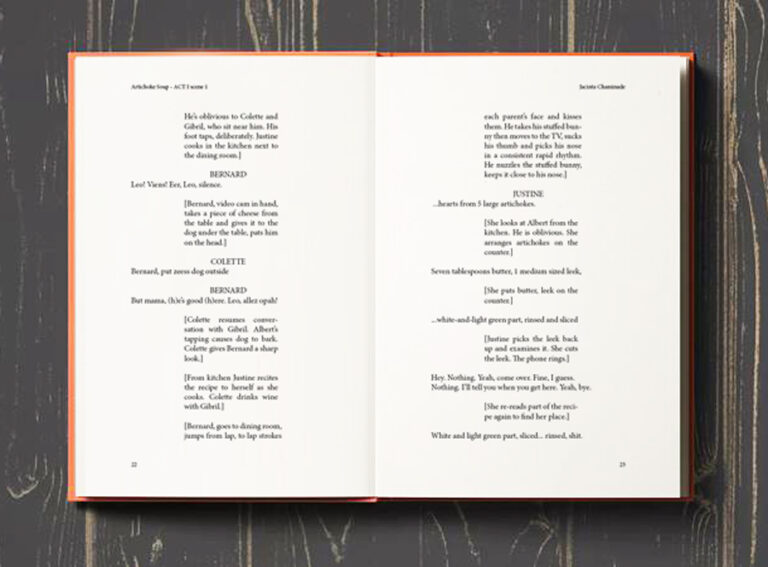
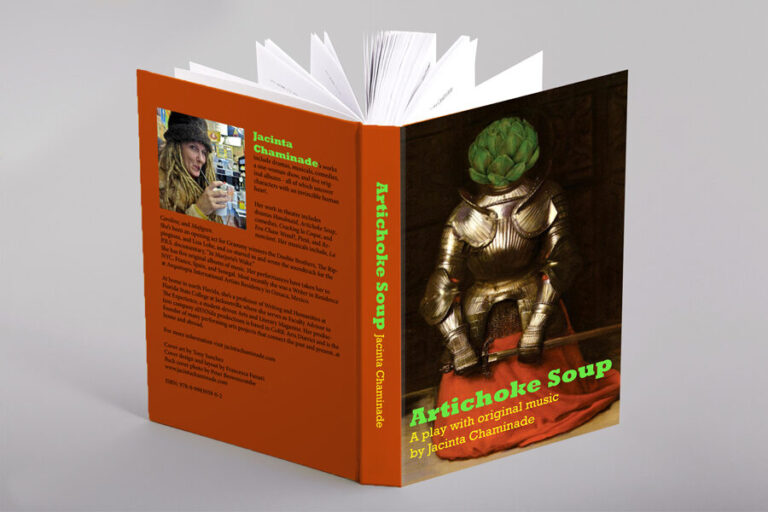
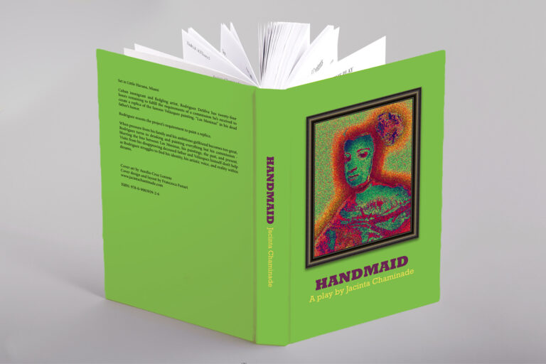
Once the paperback version of the book is in place, I like to create a unique cover. This usually requires understanding the author’s line of communication, and if it’s a publisher, many aspects need to be considered, such as maintaining an existing design or adhering to guidelines already in place for a series. In this case, the author wanted to use the same cover she has on the accompanying album, so my task was to create something around that request. We decided to use the same palette of colours from the front image and made the text stand out from the darker shades selected with a bright lime green.
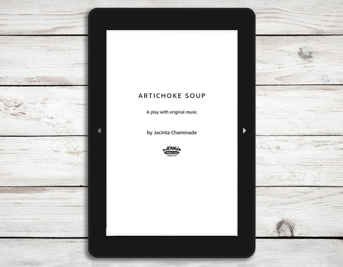
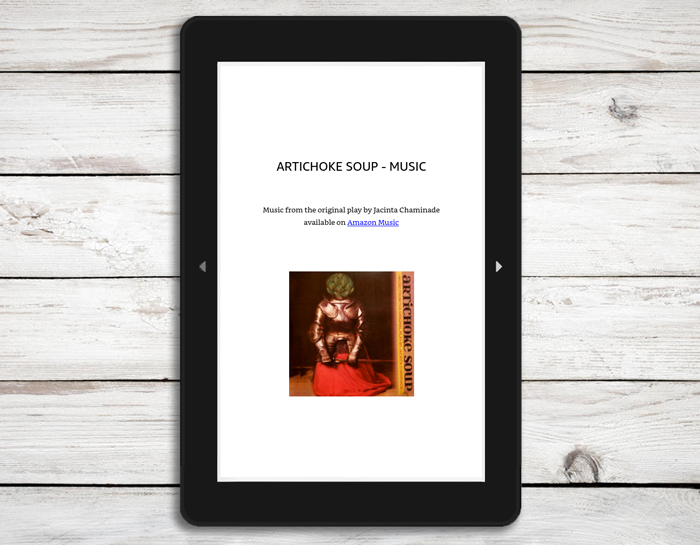
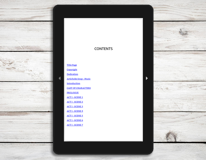
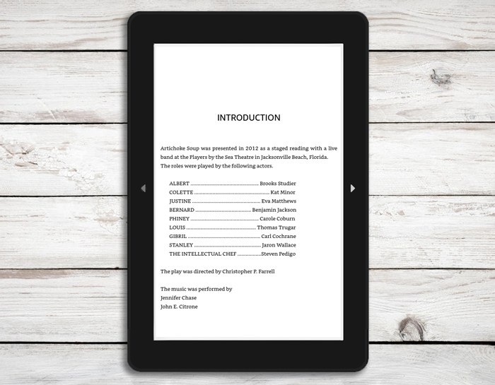
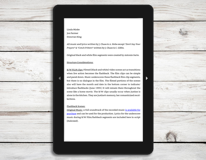
When creating an ebook, there are rules to follow to ensure the file can be read on any device, which limits some of the creative freedom available in traditional book layouts. However, this doesn’t mean the result will be less appealing; there are many ways to give an ebook character. For Artichoke Soup, I was able to maintain the structure of a play script as requested. We also included links, a table of contents (TOC), and images.
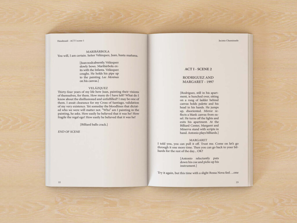
From the same author, I’ve worked on two more projects: Handmaid and I Can Smell You From Here, both the print and ebook version. Handmaid is also a play and needed the same script format already used for Artichoke Soup. Because they are from the same author, I wanted to maintain continuity using the same font and layout style for the design.
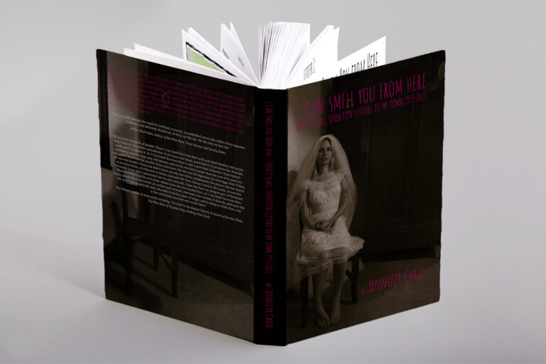
I Can Smell You From Here is a memoir that required a unique design approach. For the cover, we used an image, and for the back cover, I edited the same image to remove the person featured in the original. The font for the title, an editorial style chosen by the author, is consistently used throughout the entire book to maintain a cohesive aesthetic.
Each chapter begins with a coloured picture, require careful consideration for printing. As these are indie books, primarily printed through Amazon, customization options are limited. To avoid colour bleed-through that could affect readability, I designed a layout where a blank page precedes each image, ensuring the image always appears on an even page while keeping the text on the previous odd page clear. To minimize overall excessive blank space, I positioned the image in the centre, providing more room at the top to creatively arrange the text on the preceding page.
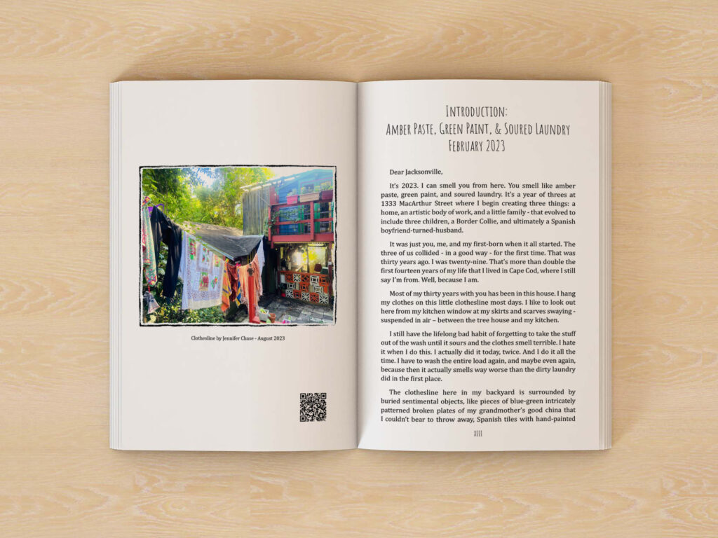
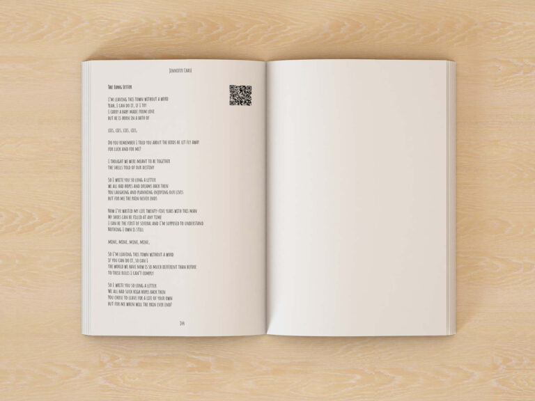
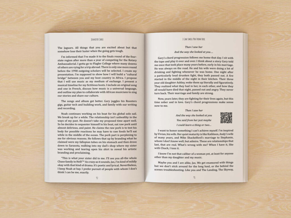
Additionally, since the memoir includes numerous lyrics, we integrated QR codes within the text, enabling readers to easily access the corresponding songs on their devices.
Necessary cookies are absolutely essential for the website to function properly. These cookies ensure basic functionalities and security features of the website, anonymously.
| Cookie | Duration | Description |
|---|---|---|
| cookielawinfo-checkbox-analytics | 11 months | This cookie is set by GDPR Cookie Consent plugin. The cookie is used to store the user consent for the cookies in the category "Analytics". |
| cookielawinfo-checkbox-functional | 11 months | The cookie is set by GDPR cookie consent to record the user consent for the cookies in the category "Functional". |
| cookielawinfo-checkbox-necessary | 11 months | This cookie is set by GDPR Cookie Consent plugin. The cookies is used to store the user consent for the cookies in the category "Necessary". |
| cookielawinfo-checkbox-others | 11 months | This cookie is set by GDPR Cookie Consent plugin. The cookie is used to store the user consent for the cookies in the category "Other. |
| cookielawinfo-checkbox-performance | 11 months | This cookie is set by GDPR Cookie Consent plugin. The cookie is used to store the user consent for the cookies in the category "Performance". |
| viewed_cookie_policy | 11 months | The cookie is set by the GDPR Cookie Consent plugin and is used to store whether or not user has consented to the use of cookies. It does not store any personal data. |
Functional cookies help to perform certain functionalities like sharing the content of the website on social media platforms, collect feedbacks, and other third-party features.
Performance cookies are used to understand and analyze the key performance indexes of the website which helps in delivering a better user experience for the visitors.
Analytical cookies are used to understand how visitors interact with the website. These cookies help provide information on metrics the number of visitors, bounce rate, traffic source, etc.
Advertisement cookies are used to provide visitors with relevant ads and marketing campaigns. These cookies track visitors across websites and collect information to provide customized ads.
Other uncategorized cookies are those that are being analyzed and have not been classified into a category as yet.